Thursday, 12 May 2011
write up
I think our work would score a 47, we would lose marks for the music on the heart beat part as sometimes it went out of time and may have been slightly too loud for the clip. Also we could of varied our range of shots from close up to long shot. Our lighting was slightly off as we recorded on 2 different days. other than these i think our film was a success.
sheets
Make up design sheet
This sheet helped us know what kind lighting and wardrobe we wanted on our characters.
The lighting design sheet
Using this sheet we knew which lights we wanted to use and tested which would look better for our genre and in the setting we were using .
This sheet helped us know what kind lighting and wardrobe we wanted on our characters.
The lighting design sheet
Using this sheet we knew which lights we wanted to use and tested which would look better for our genre and in the setting we were using .
Thursday, 7 April 2011
Question 9 - Leanne
Throughout the planning of the course We split the sheets we did equally. The sheets that I completed were:
Step outline in sound
Shot list
A third of the story board
Make up design
Lighting design sheet
A Textual analysisWe also took turns in doing the group sheets like Narrative textual analysis and the Pitching of our film.
In the shooting of the film I started to playa role in the film but due to illness I took role of camera man and directed some of the shots, although most shots before done were decided by the whole group so we all took part in all areas of the shooting.
In the editing stage I helped out to edit some clips but also gave my opinion on what I thought would look good as well as others in my group.
My main role was ot co ordinate everything and make sure all actors and members of group would meet to film the horror sequence and also picked up the equiptment when needed.
For the evaluations we spread them equally and to the areas we worked on the most.
Samuel Hutsby Question 9
Contribution.
Throughout this coursework I have contributed in both practical and theoretical sense, in the planning stage I took responsibilty for several documents within our planning,as a group we all took several activities and worked together with seperate sections of one document,
These are just a few of the planning documents I contributed to, also along side the images, I had heavy input into the scripting and other aspects such as costume design and test shots.
When filming, as you can see above, I was involved in acting but when I wasn't on camera I helped position other actors and set up various camera angles throughout filming, helping direct actors on the emotions and also the speech we needed to make our film most effective. The ideas we used aloud me to maintain constant input into shot types used even when I was going to be in shot.
Finally I took part in several evaluation questions mostly research into IMDB's database for user ratings, and target audiences etc, this was what I found most suited to my abilities.
Question 8 -Leanne
The preliminary task:
http://www.blogger.com/post-edit.g?blogID=1695401048863777753&postID=6254059250410301976
Our Final film:
http://www.blogger.com/post-edit.g?blogID=9148752754245313632&postID=206458032888775937
Looking back over our preliminary task we have used similar techniques but perfected them and took notice of the rules you had to follow while filming. While watching the preliminary task I noticed a lot of jumps and lack of continuity. Also a lot of shots didn't make sense in a horror film. Throughout the clip there are various mistakes like using both sides of the 180 degree rule and not abiding by the 30 degree rule. Also there are moments when the camera is not kept steady and where the tracks and pans are too fast and irrelevant.
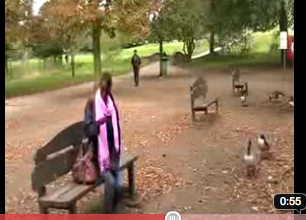 In this preliminary image there are multiple things wrong with it. In the background there was people from the public constantly walking around in the background and making noise, this made it hard for filming it and created problems when we filmed it. Also for a horror film it's very bright and sunny which doesn't reflect the mood and atmosphere in which we tried to create.
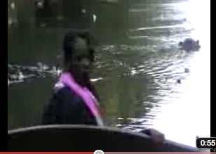
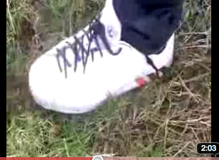 Another problem that I found in the preliminary task was the positioning of shots. We didn't use the 'rule of thirds' so found it really hard to be able to catch the shots we wanted originally. In the image you can see what we intended to be a splash in the bottom left corner. The ripple should have been zoomed in and made into a close up so the audience should notice it more.
http://www.blogger.com/post-edit.g?blogID=1695401048863777753&postID=6254059250410301976
Our Final film:
http://www.blogger.com/post-edit.g?blogID=9148752754245313632&postID=206458032888775937
Looking back over our preliminary task we have used similar techniques but perfected them and took notice of the rules you had to follow while filming. While watching the preliminary task I noticed a lot of jumps and lack of continuity. Also a lot of shots didn't make sense in a horror film. Throughout the clip there are various mistakes like using both sides of the 180 degree rule and not abiding by the 30 degree rule. Also there are moments when the camera is not kept steady and where the tracks and pans are too fast and irrelevant.


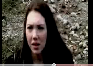
Here is a shot of the preliminary task's close up shot that we used. Here you cant really see the facial expression well . This shot should have been more of a close up and the camera should have been positioned more to the left so that the face would have been in the middle of the shot.
In our Final piece image on the right you can see the actors facial expression and the positioning of the camera was a lot better.

 In this preliminary image there are multiple things wrong with it. In the background there was people from the public constantly walking around in the background and making noise, this made it hard for filming it and created problems when we filmed it. Also for a horror film it's very bright and sunny which doesn't reflect the mood and atmosphere in which we tried to create.
 In the image to the right from our final film you can see how we changed the lighting to give it a better atmosphere and make it look more 'scary'. Also the area was abandoned so filming was a lot easier and nothing intervened.
 Another problem that I found in the preliminary task was the positioning of shots. We didn't use the 'rule of thirds' so found it really hard to be able to catch the shots we wanted originally. In the image you can see what we intended to be a splash in the bottom left corner. The ripple should have been zoomed in and made into a close up so the audience should notice it more.
 In the image to the right you can see that we got the feet in close up and clearly in the centre of the shot. By using the rule of thirds and zooming in on the shot it made the shot a lot clearer and smoother.
Looking back at the preliminary tasks I can see how much we have progressed. We have positioned shots better and continuity was no longer a problem in our final film. The sound was a lot clearer and smoother because of less distractions from the public.
If we were to do this task again I would properly add more shots of the threat and make it more obvious that something was going to happen. I would also just tweak some things in order to make it run more smoothly. But overall I don't think We would change much.
Question 6. Sam
Distribution
British Film companies have made several horror's over the last decade, these companies aid in the funding and overall supervision of the films.
Film 4 have also hosted horror film festivals over digital television to promote british horror.
UKfilm council is a prime example of a British company who produced one of the most recognised horror films of the past decade, 28 days later was released in 2002 and was followed up by the sequel 28 weeks later.
If sponsored by a film company, most of our films finance would be from the company, they would have large input in the content and marketing (e.g certificate) of the film, so if they thought more under 18's would be interested in our film then they would maybe cut some of the more gritty content to make it more suitable.
Besides using a film company another way our film could get noticed is via a film festival, (see above), by entering an event similar to this the film would be viewed by judges and therefore get notification and prestige if it won in its catergory.
We adapted scenes from several successful films to increase our films potential to succeed, scenes from films such as quarantine and 28 weeks later are key ones that have been copied to boost our success rate.
Question 4 - Leanne
In horror films there are a range of different stereotypes that they use. For gender, they normally use a 'defenseless' girl to play the victim. Their normally the one who goes into the room where the noise came from or need to be rescued. In our film we switched the roles and used a male to play the victim and gets help from a female friend. This challenges dominant ideology for horror genre.
Another gender stereotype used in horror films is the girl refusing to go into the 'scary' place. For ours we used a 'scary' house and made the girl not want to go inside. This showed dominant ideology.
Manly in ghost horror films they use children as a treat or a older male. We originally went with an elderly male that had a background of hating children but towards the end of our filming we decided that it didn't matter what age or gender it was and left it open for the audience to decide.
The setting stereotype was also something we had to consider in order to make a good opening sequence. In ghost horrors especially the lighting is usually dark or natural to create a mysterious feel about the setting. We did this in ours:
This is a screen grab from the film 'Nightmare on Elm street. We used this film as inspiration for the darkness of the setting. Here you can see the darkness is used as natural lighting just like we tried to do.
Wednesday, 6 April 2011
Evaluation questions- 2, 5, 7 and 9 Ryan Webster
Question 2 – In what ways does your media product use, develop or challenge forms and conventions of real media products.
Some general forms and conventions of a ghost horror is film are being taken/dragged away by the ghost, not seeing being able to the whole of the spirit and also miscellaneous noises, so we thought we would firstly add in a ‘hand’ coming up and grabbing the victim and then the final shot the victim getting dragging away into darkness by something not seen. The main 2 films that we have seen this done are ‘Quarantine’ and ‘The grudge’. The reason we added this convention in particular is because it is quite common and also creates a great effect of the victim now being incapacitated. This also happens in Quarantine where the woman gets dragged away into the darkenss...
In many ghost horror there is also usually just the one person that enter the scary place first, this is shown also in ‘The grudge’ where the woman goes up to the attic to investigate noises so we used this idea however changed to be a cocky teenager not being scared of anything. In my opinion we followed all conventions of a ghost horror such as not being able to see the whole of the ghost as in our all you see is a bloody wrangled arm. We challenged the conventions of girls being too scared to enter the haunted house by making a girl run after the victim had been captured by the ghost, we did this to challenge the recessive ideology of the female in horror films.
In many ghost horror there is also usually just the one person that enter the scary place first, this is shown also in ‘The grudge’ where the woman goes up to the attic to investigate noises so we used this idea however changed to be a cocky teenager not being scared of anything. In my opinion we followed all conventions of a ghost horror such as not being able to see the whole of the ghost as in our all you see is a bloody wrangled arm. We challenged the conventions of girls being too scared to enter the haunted house by making a girl run after the victim had been captured by the ghost, we did this to challenge the recessive ideology of the female in horror films.
Question 5 – How did you attract/address your audience.
We decided that the target audience for or horror film would be teenagers aged 16 – 25. We addressed this by using actors that are between these ages and dressed them accordingly. I think that we targeted the audience quite well as people between these ages are wanting to watch something that makes them jump, I believe that the hand appearing from no where and the victim being dragged away into the darkness accomplished this.
Question 7 – What have you learnt about technologies from the process of constructing this product.
To create our film we used many different technologies, these are as followed:
Internet, Blogger, Youtube, iMovie, Garageband, Logic express, Photoshop.
Without these programs we would not of been able to cut each clip up and put them together in specific places, created the titles for our film, created the music for our film, watch trailers of film of the same subgenre and create a updated blog of our progress through the project. We used Photoshop to create the beginning titles to our film and allowed us to edit the text to exactly how we wanted it, with out this program we would have been left with just plain text on a plain background. Using iMovie allowed us to add music from other software onto our finished film and sync it up. It also allowed us to make several takes of each frame so we could pick the best one out and use that one instead of just having to try and get it perfect in 1 take. We had to re-shoot a little bit at the end of our film on a different day, this day the weather was better and it was brighter outside, however with the use of editing we could darken the clip to match the rest of the film and you couldn’t tell the difference.
An example of the use of photoshop is our title...
I made sure the colour of the text was that of the shrubbery at the side so it looked as if the writing belonged there.
For the music we firstly used logic and then transferred it onto garage band... We did this so we could watch the film with the music with out adding the 2 together
We used high pitched violins to create tension, also this instrument is used in alot of other music for horror films. We used a bass drum beat doubled up to make it sound like a heart beat, once danger strikes, we make the 'heart beat go faster and faster until the end shot where the victim gets dragged away. As you can see from the images, we made a gradual crescendo of music which i think makes more tension building up because it almost allows the audience to know something bad is possibly going to happen however they can not be sure when.
An example of the use of editing the actual film is that we darkened some clips...
Question 9
For our horror intro, I personally created the music for it using logic express and garageband, once completed i added it to the film.
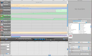
For the planning side, i planned out the first 40 seconds with a story board...
An example of the use of photoshop is our title...
I made sure the colour of the text was that of the shrubbery at the side so it looked as if the writing belonged there.
For the music we firstly used logic and then transferred it onto garage band... We did this so we could watch the film with the music with out adding the 2 together
We used high pitched violins to create tension, also this instrument is used in alot of other music for horror films. We used a bass drum beat doubled up to make it sound like a heart beat, once danger strikes, we make the 'heart beat go faster and faster until the end shot where the victim gets dragged away. As you can see from the images, we made a gradual crescendo of music which i think makes more tension building up because it almost allows the audience to know something bad is possibly going to happen however they can not be sure when.
An example of the use of editing the actual film is that we darkened some clips...
Question 9
For our horror intro, I personally created the music for it using logic express and garageband, once completed i added it to the film.

I also photoshopped the title image of the house with writing over the top.
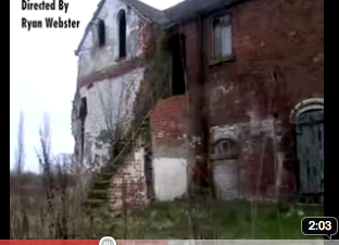
We had to re-record The final shot of our film so i took the camera home and added it to the original film with the music over the top using imovie. Whilst doing this i added in the other titles such as 'Directed by' and 'Starring' into appropriate places.For the planning side, i planned out the first 40 seconds with a story board...
Another part i had was to do a test shot of the hand coming up and grabbing the victim...
I added in blood, sticking out veins, and charred skin with bandage to create the effect of a spirit/ghost that died in a gruesome way.
Thursday, 31 March 2011
Monday, 28 March 2011
Question 1 evaluation - Leanne
The task was to produce a two minute opening sequence to a horror film, including credits. We carried out a lot of research into horror film openings and how they set the scene and plot. We watched similar horror genres to ours, like Nightmare on Elm street, and watched how that film used lighting, props, sound, camera angles and editing to add to the horror part of the opening.
Both 'The Grudge' and 'Nightmare on Elm street' inspired us in different ways. We liked how 'The Grudge' created suspense and liked how the girl was dragged into the attic. We also liked how you only saw a glimpse of the creature so it didnt give the rest off the film away. For 'Nightmare on Elm street' We liked the suspence created by music and lighting. We wanted to create a similar effect and not give too much away through dialogue. We also liked that it was a dead person and not real life.
The production worked well, although there were a few absences for some group members because of illness but I think we did well with the time and people we had. I think we worked well as a group although we could have been better organised and filmed much quicker. Another problem was getting actors and actresses sorted out and have them meet at a time and date. We worked around this by making sure all had free periods in college and filmed then. We also at first had problems with booking equipment off, so instead of selecting a new person to book it out each week we gave one member of the group to book and pick up the equipment on fridays. This helped us overcome our problem.
Quarantine trailer
We used this clip to show the drag away scene in it.
This clip helped us know what kind of camera angle, lighting and position to be in in our own horror clip. It also helped to establish a speed of the drag away scene.
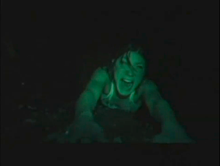
This is a still image from the Quarantine trailer where the girl gets dragged away.
We have taken this still image to show how the girl in this clip gets dragged away. We have also used this as it shows how we took inspiration for our own work. I have taken another still image from our own work to show the similarities.
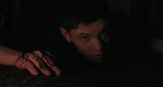
Here you can see that we kept the victims hands in front off him, just like the Quarantine, so it would create the same 'dragging effect'. Just like in the Quarantine still image we used the light just on the face and arms to create the same effect of darkness surrounding the victim. The darkness in both still images also creates the effect that the victim is talking to the audience.
Both 'The Grudge' and 'Nightmare on Elm street' inspired us in different ways. We liked how 'The Grudge' created suspense and liked how the girl was dragged into the attic. We also liked how you only saw a glimpse of the creature so it didnt give the rest off the film away. For 'Nightmare on Elm street' We liked the suspence created by music and lighting. We wanted to create a similar effect and not give too much away through dialogue. We also liked that it was a dead person and not real life.
The production worked well, although there were a few absences for some group members because of illness but I think we did well with the time and people we had. I think we worked well as a group although we could have been better organised and filmed much quicker. Another problem was getting actors and actresses sorted out and have them meet at a time and date. We worked around this by making sure all had free periods in college and filmed then. We also at first had problems with booking equipment off, so instead of selecting a new person to book it out each week we gave one member of the group to book and pick up the equipment on fridays. This helped us overcome our problem.
Quarantine trailer
We used this clip to show the drag away scene in it.
This clip helped us know what kind of camera angle, lighting and position to be in in our own horror clip. It also helped to establish a speed of the drag away scene.
This is a still image from the Quarantine trailer where the girl gets dragged away.
We have taken this still image to show how the girl in this clip gets dragged away. We have also used this as it shows how we took inspiration for our own work. I have taken another still image from our own work to show the similarities.

Here you can see that we kept the victims hands in front off him, just like the Quarantine, so it would create the same 'dragging effect'. Just like in the Quarantine still image we used the light just on the face and arms to create the same effect of darkness surrounding the victim. The darkness in both still images also creates the effect that the victim is talking to the audience.
Thursday, 17 March 2011
Samuel Hutsby. Evaluation.
AS Media Studies: Foundation Portfolio Evaluation Question
Question 3: Who would be the audience for your media product?
These statistics are from the IMDB research and user ratings, these show the average spread of voters from the audience from a typical horror from our genre (ghost/supernatural) ‘the ring’.
Votes Average
58,689 7.2
11,810 7.3
619 7.4
270 7.4
34,575 7.2
7,757 7.3
19,695 7.2
3,047 7.3
3,281 7.0
591 6.8
As you can see by the statistics shown our key audience was MALES: aged 18-29 these also rated this, the highest as well as having the most voters. This group is associated with these horror films due to marketing strategies put in place to attract the young adult audience, they like suspense and the mystery of whether this is an actual phenomenon or some explainable occurrence, we have applied this to our storyline to hopefully keep with the conventions this audience has fallen in love with.
Big Scare, 15 October 2002
Author: hlakey79 from Milwaukee, Wisconsin
Author: hlakey79 from Milwaukee, Wisconsin
I must say that I consider myself to be a lover of horror, but much too often, sex and gore is subsituted for real horror and you don't get that feeling of genuine fear in the pit of your stomach. Not so with "The Ring". Never have I seen a film that has affected me so. The images seem to tug at your subconscious, at the dark things we keep inside.
This review shows the extent of which this film affected its audience, hlakey79, a.k.a Jake Youngs 23 Wisconin. Also backed our results from the user database.
Thursday, 10 February 2011
Prop Practice
We experimented with a new prop to increase the menace of our threat. And we also noticed that i may potentially effect our genre with it crossing to monster.
Thursday, 3 February 2011
First attempt of Filming
This is our first take of filming our horror film intro. Overall the outcome was positive we were pleased with shot types, including angles although in the second half of our horror intro we hope to add a variety of different shots, for example close-ups. We'll also focus on the sound, dialogue and positioning of actors. even though we were pleased with this initial attempt.
Thursday, 27 January 2011
Sound So Far
To improve our sound so far we should listen and adapt the flat line at the end. Also finish and link all of our appropriate music.
Thursday, 20 January 2011
Storyboard part 2 and 3, recee sheet,Production schedule,time and location sheet, Sound outline
Production Schedule - This was used to make sure we had contact with our actors and make sure they were kept up to date with any information.
Recee sheet 1- This was used to plan our filing and if the building was suitable for what we needed it for. It also helped us plan all the things we needed to take with us that wouldn't be there.
Recee sheet 2
Shot list- The shot list was used to help plan out of different shots and effects that would be used. That way when were filming we can just look at the sheet and know what were doing. This again would help the filming process be much quicker and organised.
Sound outline- This step outline for our sound helped us plan out what specific sounds/ sound effects we needed at certain points in the film. That way we know exactly what we need and where to apply it to the film.
Storyboard- This is the titles of the film and establishing all the characters and the journey they took to get to the location.
Storyboard - This storyboard establishes the location of where the threat lives and reveals the purpose of the film with the boy climbing into the window.
Storyboard- This part establishes parts of the threat but you don't actually see him. shows how it all goes wrong in the clip.
Storyboard- This part is where the threat takes a victim and all is dark and quiet, this creates tension in the clip and builds the horror.
Storyboard- This is the ending off the clip. In this you only see the eyes of the threat and then it cuts to a black frame and ends the clip.
Time and location schedule- The schedule planned out the locations that will be used and equipment needed.
Subscribe to:
Comments (Atom)


